Calling Out COVID-19 Napkin Math
2020-03-26
Back home from college and stuck in quarantine, I’ve been reading too many takes on the coronavirus. Trump’s populist rambling at those daily White House briefings doesn’t do much to inspire confidence, so many Americans seek truth elsewhere. Unfortunately, good reporting has been drowned in a sea of armchair epidemiology. Now more than ever, it’s dishonest and frankly dangerous for influential scientists to blindly opine on COVID-19. Worse, many have done so under the guise of numerical objectivity, offering tenuous ‘napkin math’ that rests on shaky empirical grounding.
Let’s start with this opinion piece in Stat News by Dr. John Ioannidis, a professor of medicine at Stanford. Dr. Ioannidis opens the piece by arguing that coronavirus statistics – e.g. the case fatality rate (CFR) – are hard to infer from current data. He correctly calls the widely publicized 3.4% CFR estimate (deaths / confirmed cases) “meaningless”, because confirmed SARS-CoV-2 infections are biased towards those with severe symptoms. However, Ioannidis then proceeds to present his own calculation for the CFR based on the Diamond Princess, calculating that 1% of the infected died (and since everyone was tested, no cases could’ve been missed, in theory). He claims that we can then correct for the age differences between the Diamond Princess and the broader US to get an adjusted death rate of 0.125%. Dr. Ioannidis does mention some caveats here, but numbers are often telephoned along without their asterisks. Three decimal places of precision mean something, especially when they’re written by a Stanford epidemiology professor. But 0.125% is just as “meaningless” of an estimate as 3.4%.
It gets worse. Caveats considered, Ioannidis comes up with 0.05% to 1% as a “reasonable” range for the CFR (again, only supported by what he refers to as “extremely thin data” from the cruise ship). He chooses 0.3% as a “mid-range guess” from this range, and then arbitrarily guesses that 1% of the US would be infected. In this scenario, 10K Americans would die of COVID-19, which Ioannidis writes off as a hardly noticeable bump in the usual number of influenza deaths. Again, there’s a clear hypocrisy here: Ioannidis argues for the meaningless nature of statistics based on current data, yet expects the reader to place stake in his back-of-the-envelope calculation based on personal hunch. And his shoddy comparison to influenza based on fudged numbers is negligent and plainly reveals his biases.
Ioannidis closes the piece with a call for more data, stating that current measures in the US are akin to blindly “jumping off a cliff”. Conveniently, his piece fails to consider all the data that scientists have been using to arrive at their current recommendations. In particular, we have extensive empirical data on the effects of aggressive social distancing (or lack thereof) in countries with earlier outbreaks than ours (e.g. China, Korea, Italy). Further, we have many datapoints on COVID-19 case progression and severity in China. With these data, the Imperial College of London have used best practices in epidemiology to estimate all the quantities that Ioannidis takes the liberty of computing himself. Failing to acknowledge what evidence does exist, Ioannidis creates a false sense of objectivity with the arbitrary numbers he selects.
Also in the class of irresponsible coronavirus dismissals from Stanford professors is this Wall Street Journal opinion piece. Like Ioannidis, Drs. Eran Bendavid and Jay Bhattacharya suggest controversially low fatality rates calculated from deeply flawed ‘napkin math’. Their idea is to focus on populations where representative samples have been tested, calculate SARS-CoV-2 prevalence, and then extrapolate to entire populations to estimate infection fatality rate (IFR), the percentage of those infected who die (rather than CFR, the percentage of confirmed cases that result in death).
The authors present four examples, all of which have some issues. They first use data collected on the repatriation flights that many countries sent to evacuate their citizens from Wuhan. All evacuees were tested, and 0.9% of them had coronavirus, so the authors use 0.9% as an estimate of the actual incidence of coronavirus in the greater Wuhan area by January 31. They conclude that there were 30-fold more cases in Wuhan than Chinese authorities reported. Two statistical issues here are that (1) not all parts of greater Wuhan were equally affected and it’s possible (statistically likely, in fact) that the evacuated foreigners were in denser, more affected areas; (2) given the small sample size, there's high uncertainty in this IFR estimate that could wildly affect the conclusion being drawn. Finally, using January 31 as the benchmark date, before China’s testing infrastructure had reached current scale, is a strawman. With time, we’ve gotten a more complete picture of China’s coronavirus landscape, and most recent data is used in epidemiological studies like the ICL one linked above.
Second, the authors consider the Italian town of Vò, where all 3300 inhabitants were tested for coronavirus on March 6. Ninety (2.7%) tested positive, so they extrapolate to suggest that the true number of infections in the province (pop. 955K) was 26000 at the time, exceeding confirmed cases by 130-fold. All the above issues still apply here, though. In fact, Vò was completely screened because Italy’s first COVID-19 death occurred there, suggesting that it was likely a hotspot. Epidemiologists emphasize that spread occurs at a community-level, creating a pattern of infections with strong geographic clustering. Extrapolating a small town’s data to a province hundreds of times larger results in almost no useful signal.
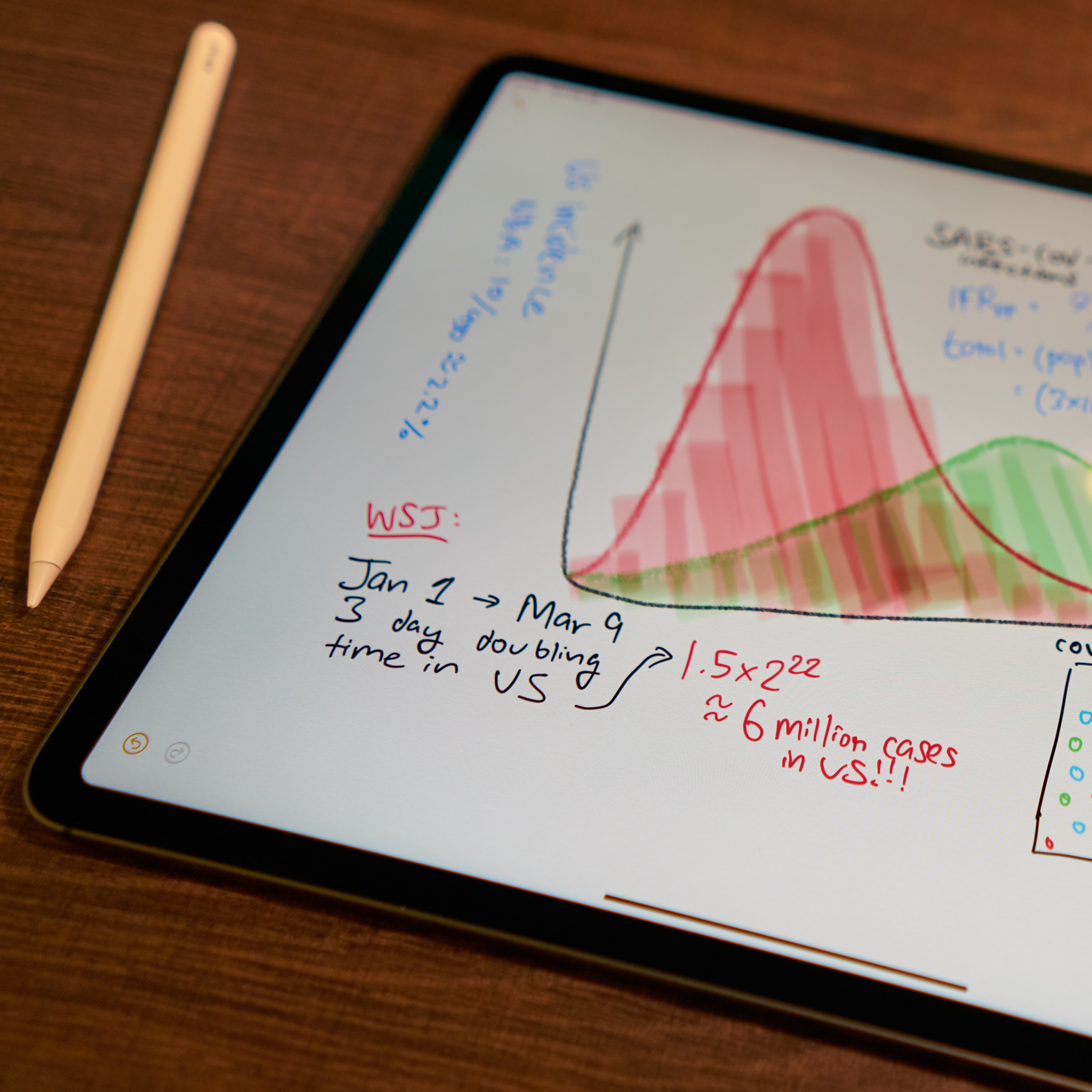
The third and fourth examples repeat the statistical flaws detailed above, so let’s skip to the closing analysis, which I find most egregious. Assuming the first US infection was present by January 1, and a uniform 3-day doubling time, the authors calculate that six million Americans were infected by March 9. Assuming a two week time from infection to death, the authors use the 499 COVID-related US deaths by March 23 to compute a 0.01% mortality rate.
I have a lot to say about this, so let me itemize my grievances: (1) discussing “doubling time” before a certain level of incidence is meaningless, (2) a three-day doubling time hasn’t been observed in most US communities, and (3) with median 5 days of incubation and 18 days from symptoms to death, 23 days – not two weeks – is our best infection-to-death estimate (at time of writing; supporting data here [1], [2]).
In general, each assumption made in this type of rough calculation injects tons of uncertainty into the resulting estimate. Uncertainty is usually expressed using a probabilistic confidence interval, but here we are given a wonderfully precise number with none of that pesky fine print.
Finally, a headline in the Financial Times claimed that “coronavirus may have infected half of UK population” according to an Oxford study. This piece gained significant traction, appearing on the list of the most viewed FT articles as of yesterday. Looking into the study itself, it’s clear that the 'hot-take' headline is entirely speculative. The researchers’ analysis takes the number of hospitalized cases as the ground truth number of “severe” cases, and then models coronavirus dynamics with different values of R0 (number of additional people infected by each case) and rho (fraction of total infections that are “severe”). Their analysis considers several different scenarios, and their most conservative choice of rho happens to lead to the headline’s projection. The scientists themselves say that they’re purely trying to illustrate the dramatic impact of their rho parameter, not that any of the particular scenarios they choose are actually correct. Biostatistics professor Natalie Dean goes into more detail here. While better disguised, blindly choosing parameters in epidemiological models can be just as misguided as napkin math. It’s key to understand a model’s caveats before using it.
I wish we had perfect data on the coronavirus. Instead, we’re left with a few countries worth of incomplete, heavily skewed data stew. There are grains of truth there, but we must prioritize statistical rigor while looking for them. We enter dangerous territory when we throw our hands up and start believing any figures that are tossed at us. Napkin math is usually opinionated, and so it’s important not to be fooled by the objective allure of numbers.